| While partnering with an agency we designed the identity for Personal Choice. this is a Blue Cross insurance product designed for specifically for people who can't be part of group insurance. Identity was used extensively for print, and television throughout Wisconsin and parts of the Midwest for years. |
|
|
|
|
|

|
Milwaukee advertising agency wanted a strong corporate look that portrayed their unity and strengths in consulting, marketing and advertising.
If you don't have a pdf reader you can get the plug in here:
If you don't have a pdf plug in you can view a larger jpeg version, click here |
|
|
|
|
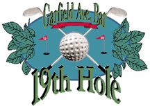
| Local Milwaukee bar wanted a logo for a possible new identity. Golf was the main theme. Logo was never used and there fore sample is a little unfinished but still interesting. |
View the jpeg |
|
|
|
|
View the jpeg |
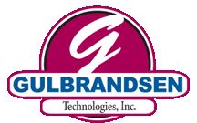
Gulbrandsen wanted a new look for their company. They specialize in chemical mixing. They wanted an identity that showed strength, speed and reliability. Here's some examples of our ideas that were presented. |
|
|
|
|
|
The Black and Blue Ball needed to update their logo for the Ball. As we handled the all the literature we also partnered with them to create this updated version on the Ball's logo.
|

|
|
|
|
|
View the jpeg |
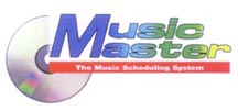
Music Master wanted an updated version of their logo. Being that it's an automated music system we thought the CD icon was the right choice.
|
|
|
|
|
|
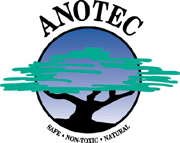
Corporate identity for an odor neutralizing product. Their product was one of the first to the market. They wanted a natural look with clean refreshing colors. Click on the image to see a larger size.
|
View the jpeg |
|
|
|
|

View the jpeg |
Logo design for a company that specializes in water treatment for home and industry. Identity is strong and eye catching. |
|
|
|
|
|
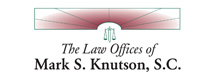
Identity created for a local Milwaukee law firm. They wanted a strong yet angelic feel to their identity. Click on the image to see a larger size.
|
View the jpeg |
|
|
|
|
View the jpeg |
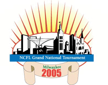
Logo designed for a Milwaukee Forensics Tournament. Here is a good example of how a logo will change from what we present to what's finally chosen. Click on the image to see how it all came out. |
|
|
|
|
|
Logo and identity for a lighting design company. The owner wanted an earthy feel with a clean business execution.
|
|
|
|
|
|
 |
Pain Management wanted to update their identity and change all there literature. We gave them a fresh new look that seems to fit them well.
View the jpeg |
|
|